Disclaimer:
The creative process, even in artistic fields, is often not a case of sudden magnificent inspiration, but rather the end result of cold analysis of what works or doesn't work, calculated experimentation, and iterative design. If you are someone that doesn't want to know how the proverbial sausage is made, I caution you against reading further.
…Book four. Forget headwinds, the march to get this book done, at almost every stage on almost every level, was like walking into a hurricane. But done it is.
Once again Tom Edwards was used for the cover design. The concept, as presented to him was as follows:
As for ideas, yes, I do have some. The book is in the next in the series, but it takes place in 2010 New York City (time travel). The main character is a black teenage girl. I was looking for hair references and found this picture. This is basically exactly how she looks (minus nose ring):
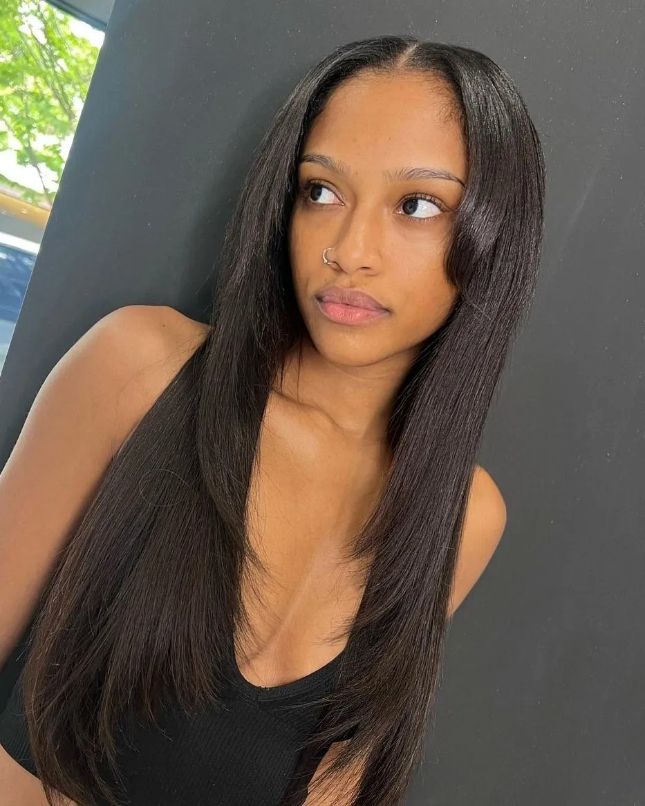
Note: It’s pretty rare that I see a model or actor/actress that looks exactly like my “mind’s eye,” but this girl is bang on for main character Maxine
Clothing I'll leave to the artist, but think average teenage highschool student (no school uniform, no midriffs...I hate midriffs). I'd like her with a backpack, if it works. More importantly she has what can best be described as a diamond ring (left hand ring finger). It glows very brightly blue. I'm thinking her on a city street (artist discretion if you want a famous NYC locale) with the street behind her basically going to hell...think war not natural disaster. Some quick examples of what I mean:
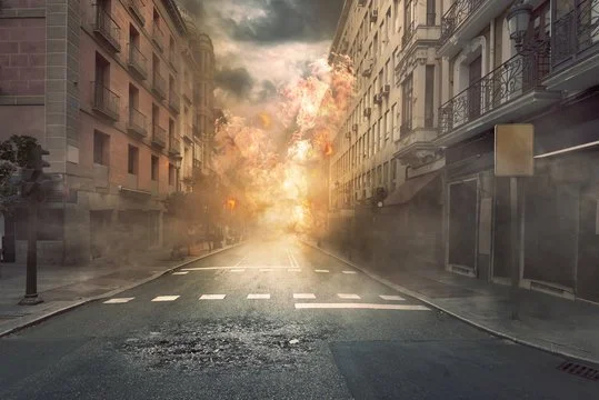

(Background troops, aircraft, vehicles at artist discretion)
The girl, however, is so enamored by the ring she is oblivious to everything going on. I'd also like large bluish-white sparks along her shoulders and arms.
Action Girl Returns
The first rough:
The title of book four is, The Baptism of Power. Like how Monster of the Dark occasionally is mistaken as Monster in the Dark, Mr. Edwards mistakes The Baptism of Power for the more common Baptism of Fire. My comments below:
Like it so far. Just a few things:
1. The title is "The Baptism of Power"
2. I think the posture could be more feminine, closed, vulnerable. (Closed legs) Some examples of the "energy" I mean:


3. In the same vein the expression, to me, comes across as too foreboding. I think the contrast between what is going on in the background compared to her interest in the ring on her finger is what sells the cover. So, curious...yes. Focused...yes. More "what is this possibly wonderful thing" than "OMG what is this." The pictures below are girls looking at cell phones, but the expression is the closest I could find to what I mean:


4. Lastly, a little more "kinetic" with the sparks. The idea with me was always related to Godzilla, so may as well reference the source. Note how the sparks not only arc along his back, but out from it (They don't literally need to come from the girl's back, but you get the idea)
I Finally get my Sparks
Further refinement for the cover:
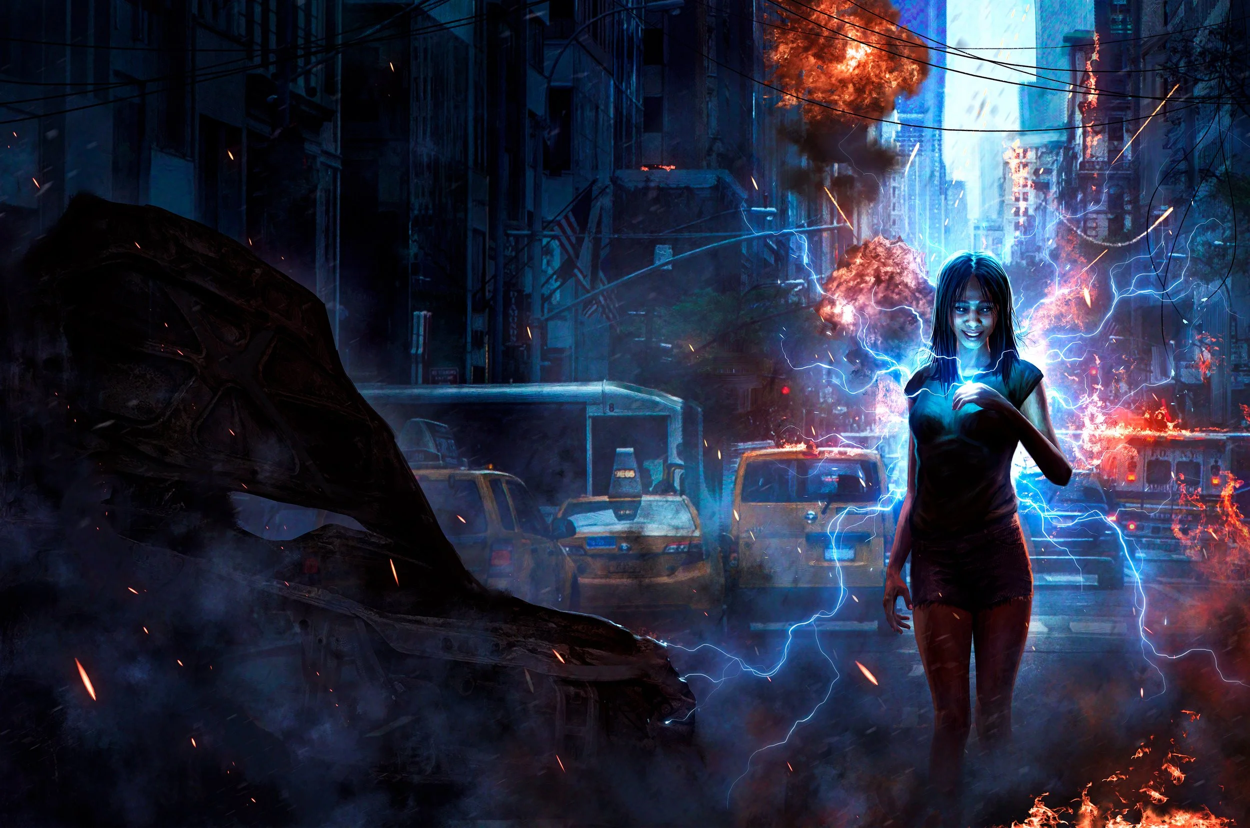
Near final version:
My comments:
I like the background and the cover overall, but I can't say I love it. We're very very close.
1. As I said, I like the background, but it is hard to see. Perhaps it could be brightened?
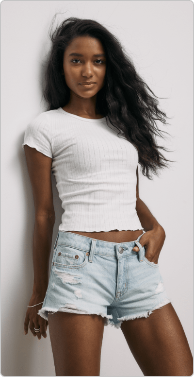
2. Probably should have mentioned it earlier, sorry. But more youthful in the character design. I like the body and the pose. My issue is one of those intangibles that is hard to explain with words. I'm thinking it might be the clothes. Perhaps something like jean shorts? Top is fine, but it would have to be short sleeved instead of the long sleeves it currently has to make sense in the new context. A reference image:
3. Lastly, I'd like the circle surrounding the "4" to be broken or crumbling.
Sorry to send you back to the drawing board,
Mr. Edwards response:
Hi KT.
Thank you for the feedback. It all looks good to me.
I'll work on the changes and send a new version before the weekend.
With the background, I made it darker to allow the lighting, explosions, and blue light to pop more. How light would you like me to go?
My reply:
I was thinking that the darker setting was chosen for that reason, and it really does make those details pop. However, it also makes it hard to get a sense of place. My wife couldn't tell where exactly she was supposed to be until I said it was a city street. It was only then that she noticed the details. Hate to throw it back on you like this, but you're the artist. It's kind of hard to answer, "how bright?" Best I can really say is bright enough so that you can tell (easier) where she is. That's the best way I'm able to describe it.
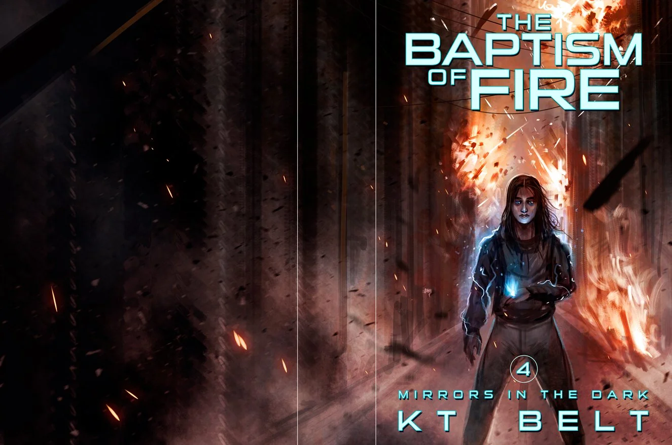
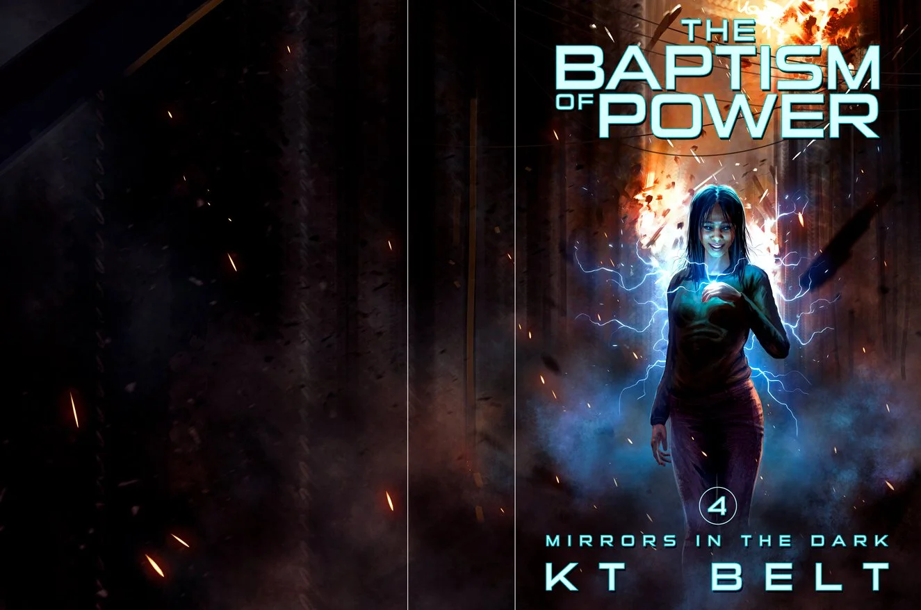
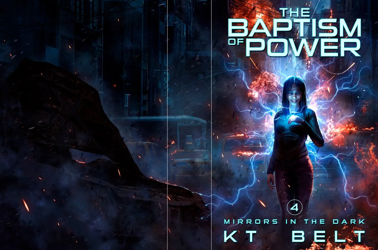
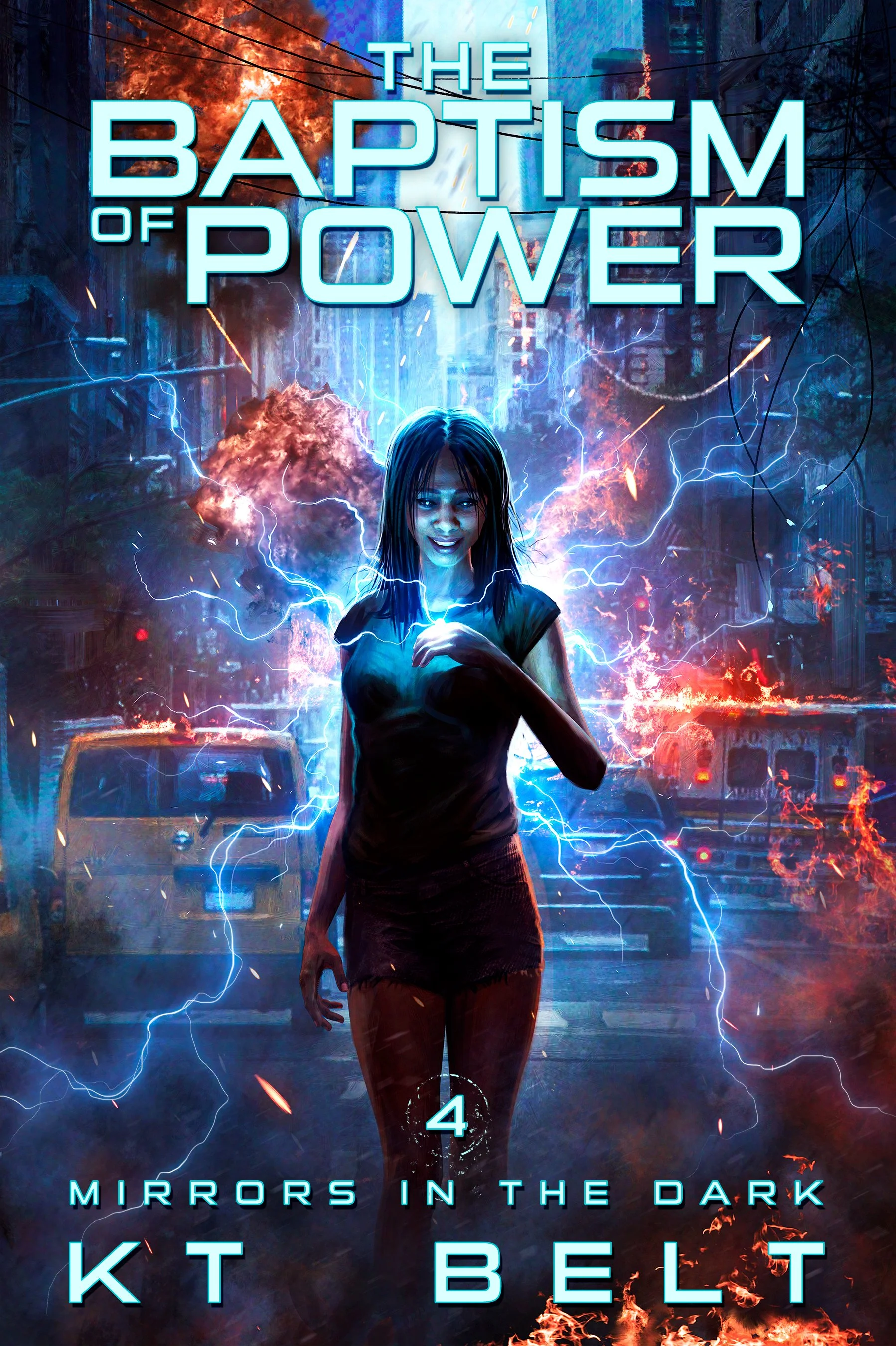
The final final cover, both with title (note the crumbling ring around the “4”) and art only:
I’m proud to announce The Baptism of Power book four in the Mirrors in the Dark Series.