
Disclaimer:
The creative process, even in artistic fields, is often not a case of sudden magnificent inspiration, but rather the end result of cold analysis of what works or doesn't work, calculated experimentation, and iterative design. If you are someone that doesn't want to know how the proverbial sausage is made, I caution you against reading further.
Sequels. As mentioned in part one, an original work has the difficult task of enticing a reader to pick it up and give it a read. Its sequel has to the additional complication of not only having compelling artwork, looking good in an image the size of a thumbnail, communicating genre at a glance, but also indicating that it is a continuation of an existing work.
Some examples from arguably the most famous sequel in pop culture.

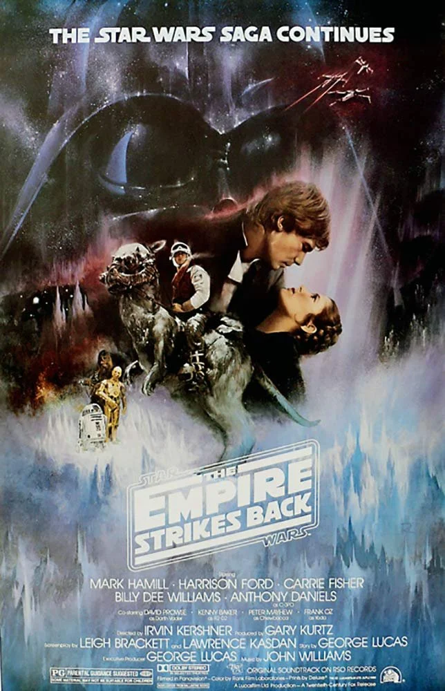

Note how “The Star Wars Saga Continues” is printed prominently as is Darth Vader, who is the most striking image in all of Star Wars.
While the intent might be the same, there is a difference in the execution of a movie that has a budget of tens of millions of dollars and a focus tested marketing campaign verses that of the typical independently published author. Many authors, having made a cover that is appealing to look at and effectively communicates genre, often use variations of the original theme for the sequels.


Of course, me being me, the expected tried and true methods of how to proceed were chucked out the window after a stream of nutcase incoherent curses of “where’s the fun in that” and “I’d rather do it my way.” For me, the cover for book two must be visually striking, must communicate genre, must be visible in a thumbnail, but absolutely must not have a visual theme that is the same as Monster of the Dark.
While each book in the Mirrors in the Dark series is a part of the same continuing story, there are minute changes in the sub-genre of each that change how the story is presented and told from book to book. They are as follows:
Monster of the Dark - character study/coming of age
The Rogue Wolf - thriller
Cause of Death - military sci fi
“Book Four” - tragedy
Genre hops like this tend to frustrate readers as the average reader expects the conventions of genre to be consistent from book to book. Enjoyment typically follows expectation. While I am cognizant of that reality, the throughline in all my writing has never been in how well I follow specific genre tropes that readers are looking for. Instead, my intention has always been to have a general set of expectations that KT Belt readers are looking for. As my editor said regarding book four:
“As your stories always seem to be, this one is fun, adventurous, dark, and thought provoking!”
I’ll take that as a tagline.
For The Rogue Wolf I elected to use a different cover artist, Tom Edwards. I liked the work that Jeff Brown did for the cover of Monster of the Dark, however, he is quite expensive and difficult to schedule. Mr. Edwards is based out of England and all our correspondence was through email. The initial concept was present by me as follows:
I'd like a young woman in close up, pretty, blonde, hair in a ponytail, facing outwards from chest up (not sexualized). Her eyes are glowing a bluish-white (no visible iris). There are also bluish-white sparks of electricity emanating from her body. In the background there is a "futuristic" city. I don't really care about the specific style, you may indulge yourself. However, if it is possible, I'd like the thematic aspect of the city being a forest, without the city actually looking like trees, leaves, or anything of the like. It's easy enough for me to type here, but I'm not exactly sure the best way to translate that theme visually. The best concept I can think of, for the moment, is normal trees in the immediate background with the city behind them. The trees cover the base of the buildings giving the visual impression that the buildings are a continuation of the trees, though they are not. I'm especially open to suggestions on that element.
The request for a city “coming out” of a forest is a visual symbolic reference to Gungnir’s description of how and why Clairvoyants were trained:
“It’s ridiculous, but they believed monsters and horrible beasts lived in the forests and other dark places.” He paused before he continued. “A war is raging, but if you haven’t noticed, none of that war is taking place here or on any world with a large Clairvoyant population. When the sortens or Eternals attack other worlds, they have to kill every last man, woman, and child to be certain they can hold the territory. That is why we are here. We are wolves,” he said, turning around. Behind him, Carmen could see the clouds break, once again covering the facility in the shadows of Haven City. “And we aren’t able to give pause to those who want to enter the forest if we aren’t vicious. More than that, we can never leave the forest, otherwise those taking refuge within it would be rendered defenseless.”
-The Rogue Wolf
Mr. Edwards asked why the character would be wearing and below is my reply:
As for her clothes, within the context of the story she would be wearing body armor that is constructed as a one piece bodysuit, which is of a flexible fabric similar in concept to kevlar (dark grey in color). Sounds interesting as written for a science fiction novel, but visually boring. My only real preference for her clothes would be something that appears obviously "tactical" that has high mobility and little to no encumbrance (still dark grey in color, if suitable).
A quick example of where my mind is going that I found online (for a man, but you can get the idea):

I try to include reference images, where possible, to help the artist
What I like about this example is that the general cut and subtle changes in color trim implies athleticism without over the top showing of muscle definition. Unfortunately, I can't find a similar female iteration. Most are sexualized to the point of functional uselessness (within context of the character) or makes the woman look androgynous.
Canonically, Carmen’s body armor is designed to stop high velocity projectiles while also having a sacrificial ablative layer for extreme heat resistance. While not explicitly described in story, the only practical way such a piece of kit could work is if were made of a type of nanofiber that was able to intelligently reconfigure itself just prior to any impact to defeat the incoming projectile. More than likely, becoming a laminate of an ultra-hard surface with softer sub-surface layers to prevent shock from transferring to the body.
In reality modern military body armors are designed to protect the vitals (head and chest) almost exclusively. High-powered rifle bullets can only reliably be stopped by heavy ballistic plates.

Action Girl Returns
The initial concept sketch:

My response:
I must say I quite like the visual of the "forest" with the city behind it. I wasn't sure how that element would come through, but it mixes quite nicely. For now the only change I'd like is with the character. I'd like more feminine, less (overt) power. Some hips and an actual bust (not too excessive) would be nice as well. Perhaps even some vulnerability. Unfortunately I can't find a poise of what I'm speaking, but there is implied danger with the eyes (like how they came out). By the nature of the character and the story, the implication is all that is really necessary.
Quick example of what I mean:
I am absolutely NOT saying use this poise or this theme, but the implication is quite clear—sexy and dangerous. I'd like (if it is possible) vulnerable and dangerous.
Mr. Edwards asked for my opinion on the general mood and theme. I said I liked it and the clothes, but wanted a softer more “feminine” pose
Pose concepts:

Alternate 1

Alternate 2
We were getting closer. The gun had to go. I like Mr. Edwards inclusion of it, but canonically Carmen has no need for it. The pose, however, was too “Action Girl” for the character. It was hard for even I to detail exactly what I was looking for. So, I stood in front of a mirror and played with various poses until I found one that fit.
My response to Mr. Edward:
I had a thought of how she stands that I think will get us there if you don't mind me detailing in text:
Instead of standing square, as she is now. I think it will work better with her body rotated away (both shoulders and hips). By my mind's eye it doesn't make any difference if her body weight is on the back leg or not, but you're the artist, so I'll leave that to you. Her rear hand is on her hip and her lead hand is near her lead leg in a "relaxed" position. Lastly have her head rotated slightly forward, chin down.
I then provided some reference images:
I did some searching and was able to find some visuals that point toward where I was thinking. Once again, not interested in the hair or expression, just pose and posture.
I think this picture is near the closest I'm thinking of:

Her legs can't be seen, but she is even weight on both. She has her head tilted and is slightly chin up, as I said I'd like the character's head straight and slightly chin down. The arms, of course, are also not what I suggested.

This woman is in a similar position. Her lead arm is relaxed near her leg, as I suggested, but her rear hand is not on hip. Her legs are apart, unlike the woman in the first picture, not sure if that would make any difference.

This picture is similar to the first two, but she is arching her back, neck, and lead shoulder denoting submissiveness. To me it looks awkward in a way that's hard to place.

This woman is somewhat, though not completely, squaring her shoulders even though her hips are rotated away. Majority of body weight is on the rear leg, with almost "L" shaped feet. She is in effect leaned away. It "might" work, but I'm not completely certain.

An exaggeration of the previous picture. Her shoulders are no longer level and her rear arm is now invisible. Once again, there is an awkwardness to this pose that is hard for me to place.
Hope that helps
Mr. Edwards then provided sample poses to choose from:

Of these, I requested the head of 3 on the body of 1. In the meantime, detail of the background was proceeding:

Carmen placed back on the cover, but with the detail of hair to be added:
Hair, long beautiful hair
Generally speaking, with women, I write hair as analogous to psyche. For Carmen, her ponytail represents the psychological restraint instilled in her from her training in Monster of the Dark. It is not a tight ponytail as she is consciously aware that she is not her “true self,” the restriction producing a constant low-level frustration. It is not explicitly stated, but as the series progresses her ponytail actually gets looser. In the final book she has no ponytail at all.
My response to Mr. Edwards:
With regards to hair, some ideas. I somewhat liked the hair in the previous sketches, much more so than the hair in the last sketch that had hair. If I can get something similar to those, with maybe a little more volume to make her look "girlier" I'd appreciate it.
A few reference images. Ignore the face, expression, and head position, I'm just talking about the hair:
I like how her bangs frame the face

Similar style, viewed from the side
Once again similar style, but more volume...possibly too much in the tail, if only slightly.

Despite differences in the theme of the cover there were elements I wanted to continue through the series. Namely fonts and how each book was numbered. Detailed below:
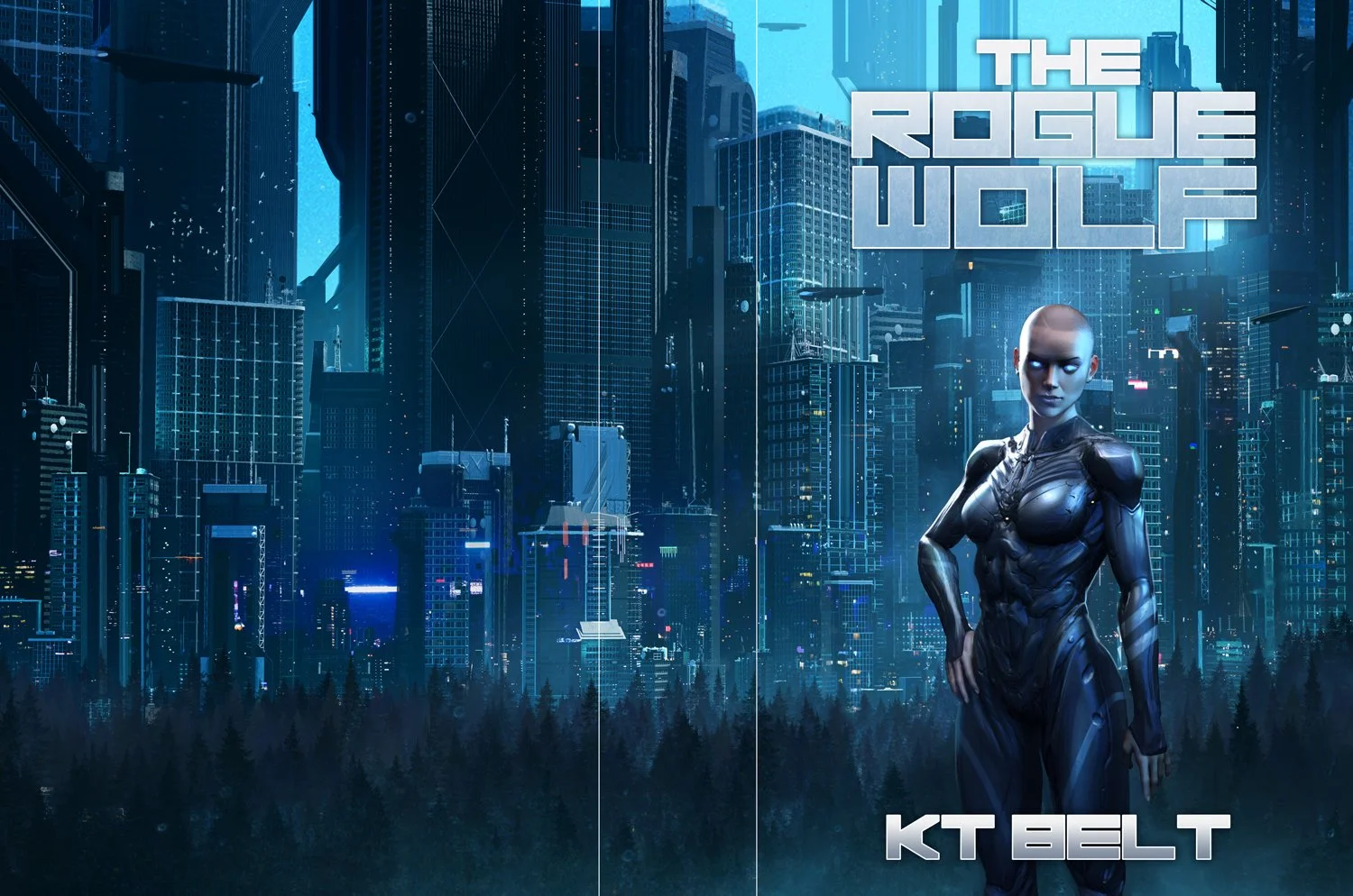
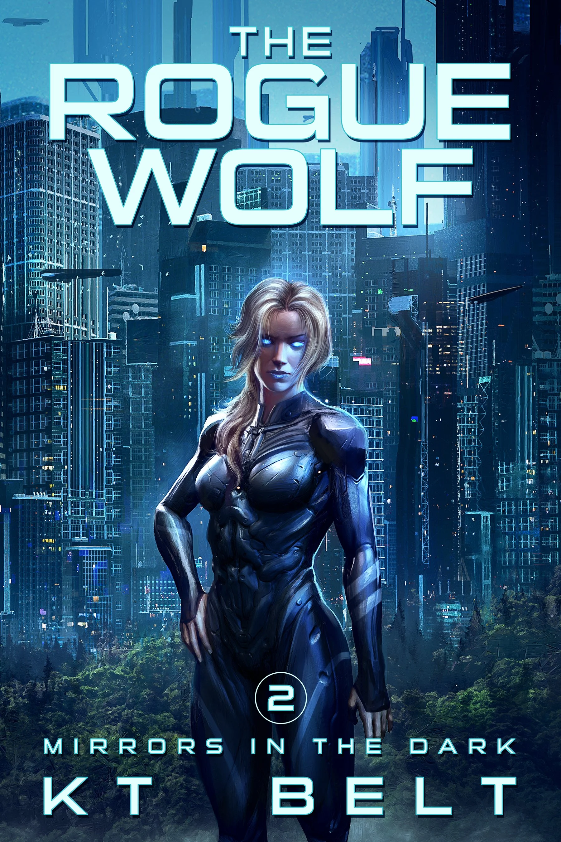
Unrelated, this is actually the second book in the series. I'm working with a different cover artist concurrently on that book as I'm working with you. At the time I started this I wasn't sure if I wanted to include the series name on the title (which is "Mirrors in the Dark"). I have since decided that I would like to. I do like how the other artist included the series title on the cover, with a horizontal line, and a number for the book (in this case it would be "2"). Reference below.

The title of "The Rogue Wolf" can stay at the top, but I do also like the less blocky font here.
The final cover (art only):

And with title in series standard font and number style:
The production work for book one and two was happening almost concurrently. Two different artists two different styles, and I like how both turned out. Next this series continues and there is yet another change of theme with book three.